It is true that this is not true for the long-form summary of the science.
What I mean is that this graphic is out of the “Summary for Policymakers”, which is approved by policymakers and a fairly political document.
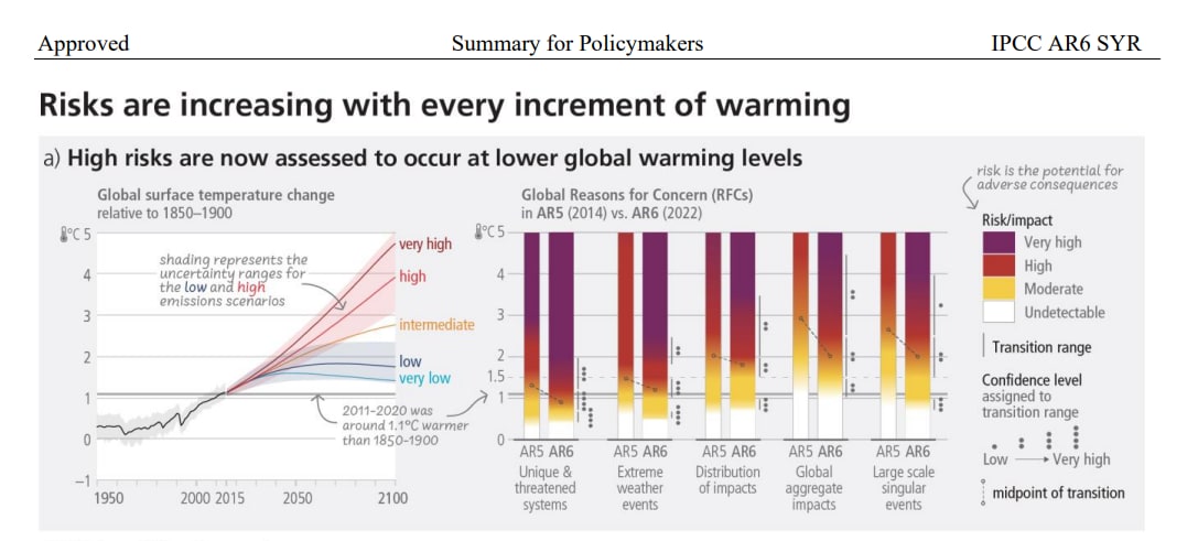
Less formalistically, all of the infographics in the Summary for Policymakers are carefully chosen and one goal of the Summary for Policymakers is clearly to give ammunition for action (e.g. the infographic right above the cited one displays impacts in scenarios without any additional adaptation by end of century, which seems like a very implausible assumption as a default and one that makes a lot more sense when the goal is to display gravity of climate impacts rather than making a best guess of climate impacts).
Sorry for the delay!
Here is a good summary of whether or not the recent warming should make us worried more: https://www.carbonbrief.org/factcheck-why-the-recent-acceleration-in-global-warming-is-what-scientists-expect/
It is nuanced, but I think the TLDR is that recent observations are within the expected range (the trend observed since 2009 is within the range expected by climate models, though the observations are noisy and uncertain, as are the models).