Guidelines on depicting poverty
Context
In Autumn 2015, the Giving What We Can Cambridge chapter organised an event described as a “poverty simulation.” Many found the content and presentation of the event disrespectful. We thought it was important to learn from what had happened, to start a conversation on how to represent poverty in a respectful way. We asked for the help of Michael Middleton, a photographer who has worked on representations of poverty and delivered a talk on Poverty: Lessons Learned From Photography in several universities. Michael kindly wrote a set of guidelines for GWWC chapters on how to depict poverty in public forums. Marinella Capriati, Alison Woodman, Rob Wiblin, and Julia Wise summarised, re-elaborated, and built on his original guidelines. Michael Middleton was consulted for these documents, but does not necessarily agree with all sentiments in the final versions. For more information, you can contact him at mike@luxocula.com.The document below is the result of this collective work.
Why these guidelines?
While discussing effective altruism, we often find ourselves representing poverty—for instance, by using a picture on a Facebook group, or writing on a blog post. Representing poverty is a complex and controversial matter, and doing it in a sensitive and respectful manner is far from easy.
Even when well-intentioned, we can make mistakes that deeply offend others. Reactions to insensitive or inaccurate depictions of poverty can be especially potent when they are perceived as coming from a place of elite, privileged distance from the problem, or from a belief that one can “throw money at the problem.” It’s easy for depictions of poverty to make us look like we are naive and think we have simple solutions for everything.
While people in poverty are indeed more vulnerable than those with more resources, charity advertising has played these aspects up to an extreme extent. Despite different circumstances, people in poverty are similar to anyone else in a lot of ways. And just like anyone else, they are also not identical to one another, but marketing pressures have created an incentive to portray everyone in poverty the same way.
These standardised representations of poverty can give the impression that the situation is hopeless. In 2012, Oxfam released the results of a 2,000-person survey showing that negative images of poverty had become so pervasive as to lose purpose. A full 75% of those surveyed described themselves as ‘completely desensitized’ to images showing hunger, drought and disease. While 75% did believe it was possible to end hunger in places like Africa, only 20% believed they could play an active role in achieving this outcome. This kind of paralysis is exactly what we want to avoid.
Some history
A standardised representation of poverty
NGOS have typically used visually strong, information-low depictions whose primary purpose was largely to incentivize the public to make donations to the charity. Often, the individuals depicted were shown in the starkest context possible to enhance the image’s effects, and very seldom did they give consent or have control over how their image was being used.
Newspapers, television news and other forms of journalism focus on events they consider noteworthy: this has often meant they are biased towards negative situations (war, famine, genocide) as opposed to positive ones (the progress of numerous cities and nations towards serious solutions to their poverty in the last several decades).
This has led to a standardised way of depicting poverty, which was especially prevalent in the second half of the 20th century.
Consider this example:
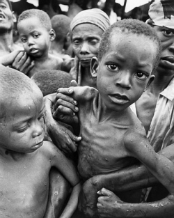
Eye contact directly from a child, who is at a lower angle than the photographer’s lens, is one of the most common visual themes in poverty photography. Notice the direct emotional connection and appeal it evokes, and how it can even distract you from the details of the image itself. The goal is to create a direct connection that elicits immediate action.
A closer look at this image clearly shows that the children are being thrust uncomfortably at the camera; it is worth contemplating why parents would be doing this; what did they expect from either the photographer, or the agency/public meant to see the image? Is it likely they were aware of the final usage?
Charities respond
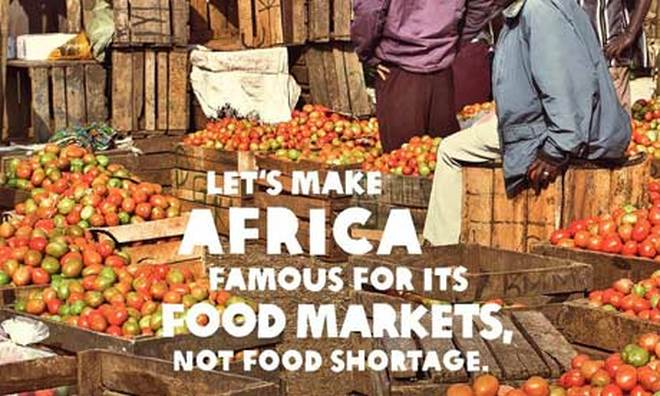
Oxfam launched an initiative to focus on telling an updated, more positive and more complex story of African poverty. The ads sought to remind people that all the help they had been giving had made a difference, and that now the story of Africa was not just one of poverty and despair; but rather, of the most complex continents in the world. This positive take on fixing poverty invited the viewer to become part of a solution that was already shown to be working, as opposed to someone throwing money at a hopeless problem.
Recently, the Students’ and Academics’ International Assistance Fund (SAIH)’s video Radi-Aid: Africa for Norway, a parody of stereotypical NGO campaigns, went viral. SAIH also runs two awards: one for the fundraising video with the worst use of stereotypes (Rusty Radiator) and one for the fundraising video using creativity and creating engagement (Golden Radiator) [edited 2020: these awards are no longer active but you can view past contests on the Radi-aid site].
Practical guidelines
These are not meant to be fixed or comprehensive rules, but rather guidelines.
Here are some common risks in the depiction of poverty:
Reinforcing stereotypes about developing countries (wild, uncivilised, etc.)
Essentializing (presenting people living in poverty as helpless, one-dimensional victims)
Exaggerating the difference/“otherness” of non-western places
Exemplifying the “saviour” complex
Gamification or trivialization of poverty
Language/content
Problematic depictions:
Presenting ourselves as the “saviours”
Exaggerating what we can do/showing ignorance of the complexity of the problems/solutions
Depicting people living in poverty as a homogenous group e.g. “the poor”
Depicting all people living in low-income countries as poor, uneducated, etc.
Making claims that are overly strong or confident (e.g. if you donate £x you will save 100 people!)
Event descriptions which present the serious topic of poverty alongside light-hearted descriptions of what the event will be like (“fun, exciting”) or involve (“drinks and snacks”). These kind of juxtapositions can come across as callous or glib.
Better options:
Try to use modest and specific language to communicate the importance of an issue. For example, instead of simply saying “With x amount we will save y many lives’, say ’One estimate suggests x amount donated here saves y many lives so…”
Acknowledge the complexity of the situations which bring about poverty. This does not mean you need to underplay the possibility of change! You can still go on to say, “However, when making choices about donations, by looking to the best evidence available we can increase…”
Avoid overly-strong claims e.g. “...GiveWell have found the world’s best charities.” Instead explain briefly what GiveWell do and say e.g. “AMF is the best they’ve been able to find.”
Images
Problematic depictions:
Interpreting visual images is of course a complex matter, and much of the interpretation relies on context. However, it’s helpful to be aware of some ways in which images can implicitly convey disrespectful messages. Here are some examples.
Looking at things from a superior position (camera angle), can work as a metaphor for power relations.
Using images of people suffering e.g. from disease or hunger, who are portrayed as unclean or unhappy. This is problematic in a variety of ways. First, it risks taking away people’s dignity. Would you want millions of strangers to see a picture of yourself the last time you had the flu? Secondly, using these type of images also risks perpetuating stereotypes about the lives of those who live in poverty. Poverty is in decline, so showing people getting medical care and getting ahead in life is actually more accurate. The most negative depictions seem manipulative because they are cherry-picked. For example, starvation as in the picture above is now uncommon. The actual more common scenario is someone not getting enough food, or sufficiently good nutrition.
Using decontextualized body parts (e.g. only eyes); it takes away the person’s individuality.
Images that play on stereotypes and emphasize “otherness”, such as showing only wild or empty environments.
Using pictures of naked (or partially dressed) people; plays up to the civilised vs. uncivilised dichotomy.
Biased representations in terms of ages, gender and race of those represented. Often these are skewed towards children and women, when the issue might also affect the whole community. Using only or prevalently images of children works as a metaphor in which developing countries are depicted as innocent/vulnerable.
Better options:
A guideline that several large development organisations use is to imagine that the person/people depicted are your close family, and think whether you would still be happy to distribute the image.
Think about whether it is necessary or even adds anything to use an image involving people. If not, consider using relevant landscapes, buildings, infographics, etc., instead.
If talking about a specific situation or intervention, try to find images from the relevant area rather than just something from the same continent.
Some examples of images depicting people in the developing world as having competence, dignity, and agency:
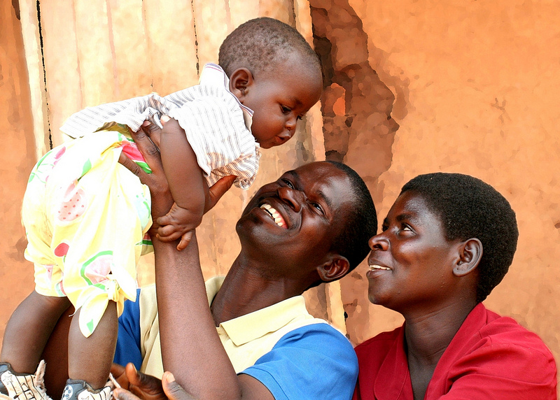
Malawian family. Child health is the goal of many anti-poverty interventions.
Credit: USAID Africa
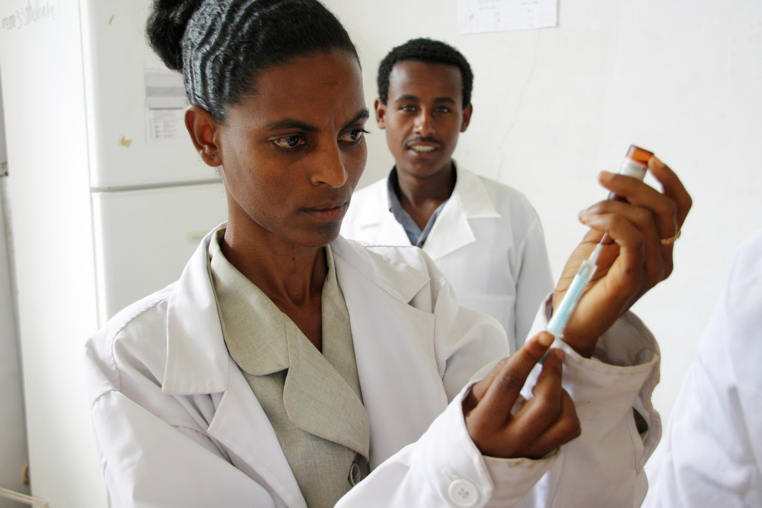
Preparing a measles vaccine, Merawi Health Center, Ethiopia.
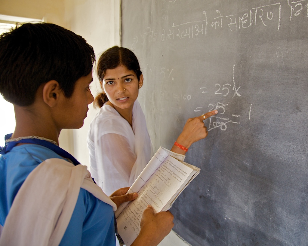
Teacher in action, Rajasthan, India. This is one of the provinces in which Deworm the World operates to treat schoolchildren.
Credit: Michael Foley Photography
- Promoting Effective Giving and Giving What We Can within EA Groups by (9 Nov 2020 1:38 UTC; 17 points)
- A Concrete Model for Running an EA Group by (31 May 2018 16:45 UTC; 15 points)
- General lessons on how to build EA communities. Lessons from a full-time movement builder, part 2 of 4 by (10 Oct 2017 18:24 UTC; 14 points)
- 2016’s Living On Less fundraiser: join EAs around the world getting sponsored to eat for under $2.50 a day by (27 Jun 2016 19:22 UTC; 8 points)
- 's comment on The great calculator by (29 Mar 2016 11:06 UTC; 2 points)
Thanks for writing this and providing some guidelines, as well as sharing how some NGOs approach it. A tangentially related post by GiveWell that may be of interest to some: http://blog.givewell.org/2012/04/12/how-not-to-be-a-white-in-shining-armor/
A random few things:
I believe that effective altruism should be held to a higher standard than most, because I will go so far as to claim that we exhibit greater empathy than on-average by caring so much about effectiveness and knowing that we are truly making a difference.
I’d like to point out how your guidelines demonstrate that The Giving What We Can event listed above and the Live Below the Line fundraiser (mostly done by others, but also by Charity Science) fail in a number of ways. Oversimplication, gamification, and trivialization are just a few of these that apply to both. I wrote this critique, which itself falls prey to some of these, but also makes these errors more clear: http://thinkingonward.com/stop-it/
I don’t think all images need to be like the three you conclude with. I find nothing wrong with the appropriate presentation of images that reflect reality, such as disease, lack of sanitation, or overall conditions of poverty. In fact, if we focus just on images like the final three, we’ll be committing the error of trivialization. I’ve had many experiences where those in difficult situations want pictures taken that show the nature of that environment, if it has a chance of increasing or improving aid.
I haven’t spent time thinking through guidelines, but the most important one that comes to mind is balance. This is of course impossible to truly achieve, but I think portraying a wide variety of images, in a way that those with experience in the community generally feel good about, is appropriate. (Of course many other guidelines are necessary, such as having the permission of the subjects.) In most cases, this will involve a greater portrayal of images like the final three, but in some truly desperate ones, those may be the minority.
And finally, easily the best ‘hack’ for this is to spend time in the places we often discuss and with the people we’re describing. Guidelines are helpful, but there’s no replacement for becoming great friends with a wide variety of people who have experienced all the things EAs try to alleviate, and learning who they truly are and what their lives are truly like.
PS:
I don’t think this is a critical part of the post, but the part below should be qualified. People are poor judges of their own actions and yet the study cited is based off self-reporting. That said, it may be accurate in the long-term, but those results are unknown. Advertising results do in fact most often find that the images critiqued here do drive donations (short-term).
“These standardised representations of poverty can give the impression that the situation is hopeless. In 2012, Oxfam released the results of a 2,000-person survey showing that negative images of poverty had become so pervasive as to lose purpose. A full 75% of those surveyed described themselves as ‘completely desensitized’ to images showing hunger, drought and disease. While 75% did believe it was possible to end hunger in places like Africa, only 20% believed they could play an active role in achieving this outcome. This kind of paralysis is exactly what we want to avoid.”
I’m not sure that simplification and gamification should be intrinsically bad things. Situationally, both can be used to get a lot of good done. The Gaming for Good events, run by Bachir Boumaaza (Athene), can be described as ‘gamification’, but raised nearly $15 million US for Save the Children. Ignoring the fact that they are not GiveWell etc (let’s imagine for sake of argument that they are, or the charity was AMF), would that outweigh any negative impacts of gamification?
When one is portraying reality accurately (people living on standards far below those of advanced economies), there may seem to be no problem (people living peacefully on the fields or in slums, disabled people asking for funds, sick persons resting at home). It is just the reality; these people are just a part of the picture. They are accepted by the society, although perhaps not as much catered to.
I am actually thinking that both portraying someone’s negative emotional appeal (that does not allow the addressee to reject donating to the acceptance and end of relationship of the appealer) and portraying an opportunity to make a great impact put the intended beneficiaries into a subordinate position. The latter only necessitates different emotional work of the portrayed—exhibiting joy and proudly grateful performance as opposed to hatred and feeling of injustice. Since those in relative power may wish to feel that they are appreciated/loved by independent persons, the latter may be a better ‘customer care’ for the donors.
The best case would be perhaps sincere reality, with all its benefits (e. g. good relationships) and economic donation opportunities. No emotions directed to the audience. This would also enable donors to make independent decisions, doing good for absolutely nothing in return.
Now the question is how effective the portrayal of just people living somewhere be in soliciting donations. I hope that highly, because providing unconditional love is what makes people feel truly well.
I’ve struggled with this issue for a while. When I was younger I used to just dismiss worries like those addressed in this post under the belief that they were unscientific postmodern claims that distorted empirical reality to avoid the uncomfortable acknowledgment that poor people suffer greatly. After living in developing countries, though, I’ve realized there really is something to it—for the most part, they don’t look at all like the always-grim pictures we get from charities.
It’s tough though, because we also want to acknowledge the suffering and persuade people to address it. My boss Dean Karlan had a slideshow in his economic development class that got a student very upset because it depicted Africa’s poverty but none of its beauty. At the same time, people like him do a lot of good for people in Africa and it seems tough to always have to portray such a complex message depending on the context. I blogged about some of the ways I’ve dealt with it here: http://www.zachgroff.com/2016/04/a-question-i-wrestle-with-at-night.html
I think portraying resilience and more nuanced pictures is a good way to go, but it’s probably a tension that’s inevitable when you want to portray suffering without portraying lower status.
Seems like the guideline—be honest, applies here. Using extreme representations to mislead others would have blowback. Not to mention that the “savior,” mentality it enforces is harmful to donors.
It seems like the advice is basically “represent Africa as being high status, not low status”. We also want to get across the message that people in the third world have serious problems that we can very effectively solve. If person A can easily solve person B’s problems, but person B can do nothing to help or harm person A, then person A is (much) higher status than person B. Why try to hide this reality? We generally don’t give charity money to our superiors or equals.
Perhaps there is an instrumental reason to pretend that this relationship is more egalitarian that it actually is. But while you reference data suggesting that traditional marketing is ignored by most people, you don’t present any data suggesting that other approaches work better.
You seem to be conflating status and power. Certainly there are a number of mechanisms whereby more powerful people tend to have higher status, but by itself that doesn’t give much reason to think that it’s better to make the status differential equal to the power differential, smaller, or bigger. Many people think it’s good to have a flatter landscape of status than we have of power (indeed I think this is a core western value).
Looking at the content of the post, it also mentions instrumental reasons for pushing portrayals in this direction right at the start: making people uncomfortable and getting attacked for it when not giving enough respect.
Any more would you like to share with us on depicting poverty?