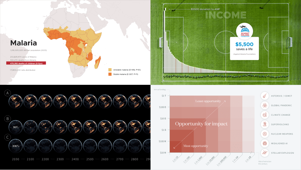
Visualizing EA ideas

Summary
The written word dominates EA discourse but visuals have a unique power in communicating ideas that seems quite underleveraged in this community. As a designer and communicator in the space, I wanted to share some of the presentations and visualizations I’ve created over the years in hopes that they might be helpful to others. My goal isn’t to present these visuals as “ready-to-use” resources—for various reasons they’re not ready (see disclaimers)—but rather as references that hopefully inspire others to create and invest in visual forms of communication.
Effective Giving 101 (2023)
In 2023, when I was director of design at Giving What We Can, we were invited to give a talk at Microsoft about effective giving. We normally don’t dive so deep into the research that undergirds our recommendations but—given the highly-educated, highly-analytical audience at Microsoft—I thought it could be compelling to actually get into the weeds and show them how serious and compelling GiveWell’s analysis is. Below I’ve excerpted two sections of that deck and linked to the complete deck below for those interested in seeing them in context.
Disclaimers
This deck is outdated—GWWC has since created an updated version of this talk which makes some important updates (GiveWell’s current estimates) and clarifications (drawing a clearer line between “charities” and “interventions”).
Full deck: Doing Good Better (Microsoft 2023)
GiveWell’s 2020 analysis of AMF
Within the context of the talk, this section comes after illustrating the importance of cost-effectiveness and the necessity of trusted evaluators. My sense was that consultants would quickly grok these concepts but might still be skeptical of these “trusted charity evaluators”. By walking them through GiveWell’s rigorous analysis of AMF, I was able to build GiveWell’s credibility, while introducing them to Malaria and ultimately lead them to the (profound) conclusion that a donation of $4500 (now $5500) can save a real child’s life.
Disclaimers
The actual analysis presented in this section (done by GiveWell & Cochrane) is incredibly solid but it’s presented by an amateur (me). I did my best to represent the research to the best of my understanding but wouldn’t be surprised if experts had suggestions for improvements or corrections in the details.
Slides: GiveWell’s 2020 analysis of AMF
Global income illustration
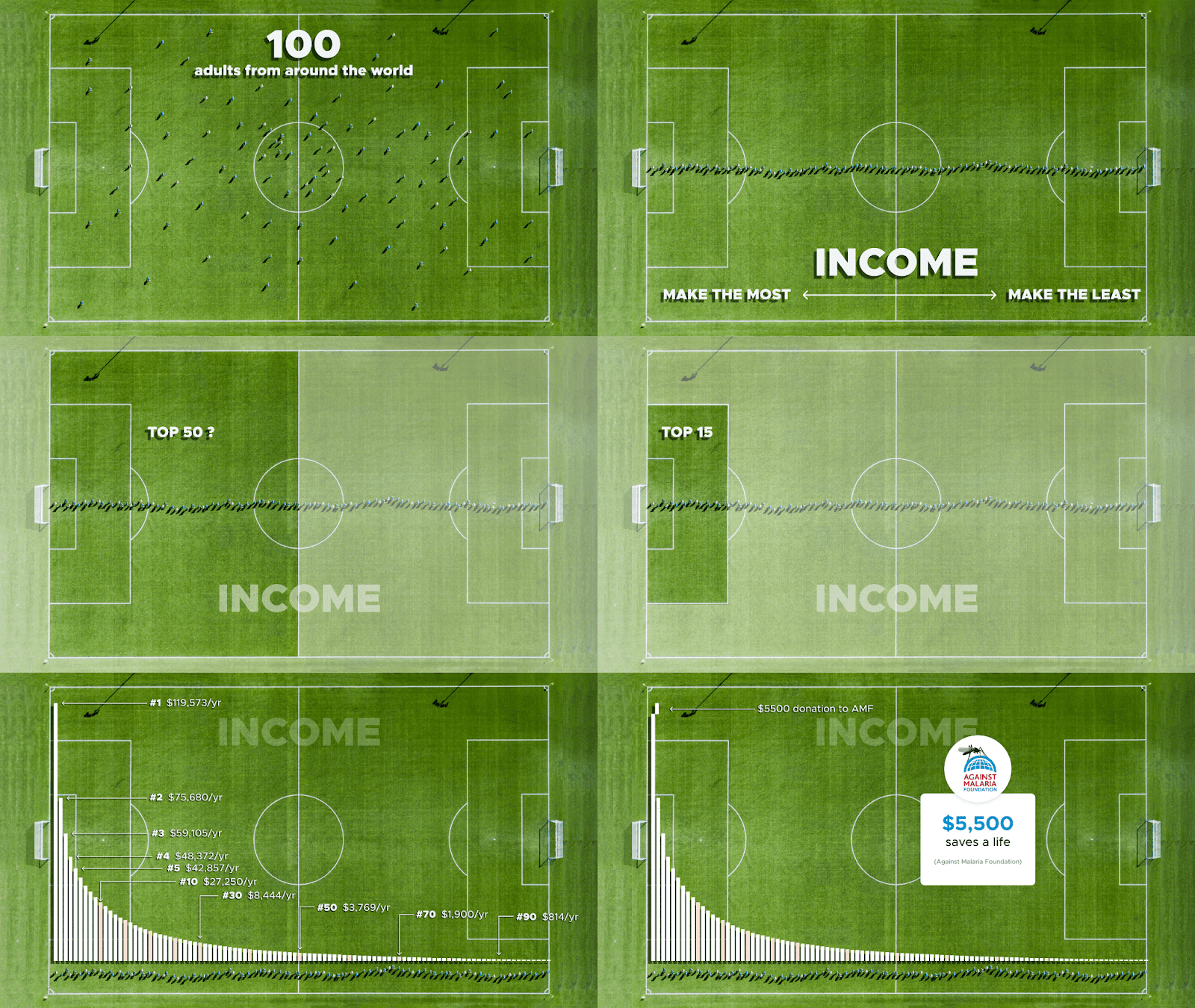
At GWWC, we spent a lot of time reminding people that “you are the top 1%” but for many reasons, simply saying that rarely resonates. Wealthy westerners understand that we are fortunate but because we’re surrounded by similarly fortunate people, it doesn’t really feel that way. In this concluding illustration, I wanted to make people really feel that top 1% position by removing them from their privileged bubble and lining them up with 100 representative people from around the world. This physical illustration shrinks the incomprehensible scale of 8 billion people down to an intuitive scale and makes your 1% position tangible and unignorable. Not only are you the first in line but you make more than half of the field combined… Should it matter that your neighbors & coworkers are also first in line? I don’t think so.
Note: I think this illustration is effective in slides but could be more powerful in other formats like video.
Disclaimers
The data here comes from GWWC’s How Rich Am I Calculator pulled in February 2023. This data was updated in 2024 making the income figures presented here ~5% lower than those in the calculator today.
The conversion of international income data to a USD equivalent comes from the World Bank’s Purchasing Power Parity Index (PPP). The conversion from GWWC’s post-tax income data to the post-tax income figures used here was done by me using standard NYC tax rates for 2022 (where I first gave this talk).
Slides: The Global Income Distribution
Prioritization in GCR (2024)
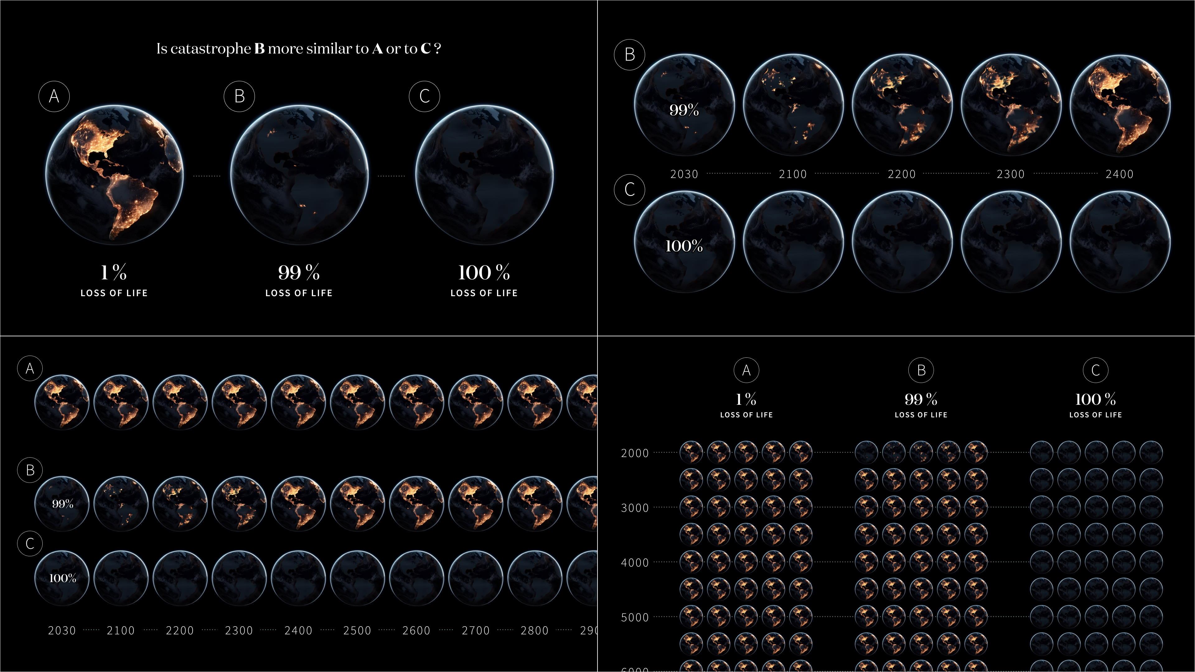
In an attempt to casually explain why EA tends to prioritize certain sources of global catastrophic risks above others, I recently put together some quick slides illustrating some guiding concepts. In the first set, I illustrate Parfait’s famous hypothetical comparing a 99% extinction event to a 100% extinction event (with some modifications). In the second set, I map all major sources of GCR on an X-Y comparing how likely each is to cause extinction this century (X) and roughly how much funding each receives (Y). Funding here is obviously a proxy for “neglectedness” and risk of extinction is a proxy for “scale”/ “importance”.
Parfit’s 99% extinction hypothetical
If you look at the current prioritization of EA, few thought experiments are as influential and philosophically load-bearing as Parfit’s 99% hypothetical. But despite its importance many communicators shy away from retelling it because it seems morbid, callous, and highly non-intuitive. This may ultimately be the right path but I wanted to try to make this an easier though experiment to reach for. In this illustration, I simply wanted to make the argument & conclusions less morbid and more obvious by (literally) zooming out from our present existence and illustrating just how different 99% and 100% events are.
Disclaimers
The rate and pattern of the civilizational recovery depicted here is (obviously) not based on anything specific. This could probably be modeled better with dedicated research (and a specific catastrophic event) but I think it illustrates the concept perfectly well.
Slides: Parfit’s 99% v 100%

Mapping the GCR landscape
When explaining my new career focus on global catastrophic risk, many people assume I’m talking about climate change or something like asteroids. In explaining why I, and the organizations I’m working for, have prioritized nuclear weapons, pandemics, and artificial intelligence above other legitimate sources of risk, this is the graph I’ve used. While these slides don’t get into the details of why certain risks are dangerous or underfunded, I think this plot nicely introduces the concepts of “scale” and “neglectedness” while illustrating why certain esoteric risks have become the primary focus of EA more broadly.
Disclaimers
The landscape funding numbers aren’t real—Well… they’re very crude approximations, done by a non-expert (me), in very limited time (an afternoon), using limited tools (Google & Claude). I believe they’re in the right ballpark but you should basically treat them as fabrications until someone actually crunches the number. (And BTW, if you’re reading this and you want to crunch the numbers I’d love to collaborate and make this a real document)
“AI Safety efforts are being outspent 2246-to-1 ” is also my own napkin math but the 2021 numbers referenced are solid. The $150M spent on AI Safety comes from a Longview report and the global AI investment numbers come from Our World in Data.
The risk estimations come from The Precipice—I consider this a great source (and ballpark correct) but of course people disagree on these estimates and Toby himself has updated some of his thinking since the book’s publishing.
Slides: Visualizing: The GCR Landscape
Bonus: Effective Giving Strategy Frameworks
Earlier this year, while I was working as GWWC’s Design Director & US Country Manager, I spent some time thinking about what should guide us as we formalized our theory of change. I created some slides pitching my ideas about how we could connect our lofty vision to concrete measurables (“Vision to Vectors”) and laid out a couple of foundational frameworks I thought could help our development of a theory or change (“The Pledging Journey”). Although the team agreed with much of the foundational ideas in this deck, they were never formally adopted by GWWC and the frameworks were not implemented as a part of GWWC’s strategy. You can read more about their high-level strategy here.
Disclaimers
These concepts are my own ideas and don’t reflect GWWC’s current strategy—(repeated from above) Although the team agreed with much of the foundational ideas in this deck, they were never formally adopted by GWWC and the frameworks were not implemented as a part of GWWC’s strategy. You can read more about their high-level strategy here.
Vision to Vectors
Slides: Vision to Vectors
The Pledger Journey
Slides: The Pledger Journey
Thank you to everyone who helped in producing the original visuals and thank you to @Aric Floyd & @Lorenzo Buonanno🔸 for the encouragement and helping edit this post.

Your visuals are awesome Alex.
EA designers—we need you 🫵🏻
This is absolutely stunning, I genuinely think I understand Parfitt’s 99% vs. 100% extinction at least 19% better after 5 seconds looking at that graphic and I love the way you illustrated Elizabeth’s journey. Wish I could afford you ;).
Which software/application did you use to create these visualizations?
All created in Figma!
Really can’t recommend Figma enough as a design tool—free & quite easy to use. Canva may be a better option for really simple stuff (especially simple motion/video) but I recommend Figma for everything else :)
The slides for GiveWell’s 2020 analysis of AMF are stellar, hopefully we can draw from them at Gi Effektivt! I particularly liked the slides that draws directly from the CEAs.
Alex – thanks for sharing these, I think they’re brilliant visualisations. I have a bunch of my own to offer… perhaps they ought to live in a shared space!
I was thinking of publishing a bunch of infographics I’ve produced in the last year or two with Creative Commons licenses (with permission from whoever commissioned the images). But I was unsure whether this would be useful for folks. An MVP might be to collect our combined works together on a site.
Would love that!
I could imagine creating some sort of collaborative repository for these types of visuals with some ability to sort by topic or concept. Great idea 🙏 Perhaps @Agnes Stenlund would also have contributions?
I’d love this too, thanks both for pushing this forward. I think it’d be great to have a space similar to the Groups resource centre, but for comms about EA (including visualisations like these). Would probably make sense to host on https://effectivealtruism.org so that journalists, policy makers, etc. can also find and use them. This work could fit within the realms of redesigning effectivealtruism.org too, since a big part of that work is to better communicate EA to the world...
I’ve already seen all the GWWC stuff (and think it’s awesome!), but seeing your more recent work on GCR visualisations reminded me how much we lost with you moving on from GWWC… and how much you’re now bringing to the rest of the EA space! Absolutely fantastic work :)
Do you by ghost of a chance have anything for Animal Welfare? I love your visualizations and have already used some of them within my local community.
Theres a cool new tool that produces cute graphics and vectors out of text.
Super useful, tyvm for sharing.
I attended a GWWC presentation at EAGxToronto and can say that I was floored by the compelling graphics.
Fun to see more of where they came from, thanks for the post!
Wow, great visuals!
Unrelatedly, for EAF admins/designers etc (e.g. @Toby Tremlett🔹) I find it pretty interesting and surprising that at the time of writing 7⁄8 comments have fewer karma than votes, even though all the comments seem benign and nice. Of course we want to preserve voting anonymity, but I wonder it you have any anonymised back-end tools to look into this, I’m not sure how common this is on other posts. I’m struggling to guess why this could be, I understand you all have good systems in place to keep bots off so presumably it’s not that, but it does seem like suspicious voting behaviour!
(I didn’t vote on any of the comments.)
Some voters are known to downvote when they think the net karma on a post is too high. If asked about too high, they would probably point to the purposes of the karma system, like deciding which comments to emphasize to Forum visitors, signaling what kind of content the community finds valuable, providing adequate incentives to produce valuable content, etc.
I think that can be a valid voting philosophy (although I sometimes have various concerns about it in practice, especially where strong downvotes are used). While the karma counts for the comments here do not seem inflated to me by current karma-inflation standards, I do not think they plausibly justify an inference of bad-faith or even “suspicious voting behavior.”
Yep that’s it I think
I don’t mind it, but will continue to often upvote low effort nice comments as I appreciate it and to perhaps encourage the behavior a little :).